 Kelly Wearstler Elle Decor August 2012
I met Kelly Wearstler a few years back, her line of textiles for Schumacher debuted at the same time my line did. She’s a charming woman, and while I may not always want to live in the rooms she designs (which is fortuitous since I could scarcely afford them), I admire her exuberance. To suggest she pushes the envelope in design doesn’t quite describe her style – unless you’re got a terribly large mailbox. I think of her as equal parts Salvatore Dali, Dorothy Draper, and Christian Lacroix… all of whom I love.
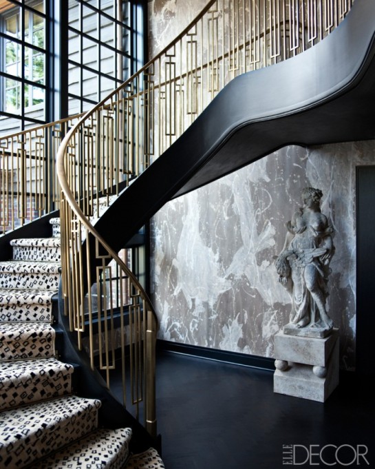
Porter Teleo, Kelly Porter and Bridgett Cochran‘s boutique wallpaper company, was catapulted into worldwide notoriety by Kelly Wearstler when the Red/White ‘Tangled’ paper (in the much discussed Duplex staircase) was published in AD. I’m a fan of PT’s papers and wish them continued success. I was shopping at Dessin Fournir on Monday – looking at their line got me to thinking about large-scale wallpapers. I decided to do a showroom crawl in search of the new, the not-so-new, and the venerated grande repeat papers. Here’s a roundup of my favorites & the resources.
……….
‘GLOW‘ designed by Boone Speed for Flavor Paper
Flavor Paper, the Brooklyn base company that’s on everyone’s ‘au currant’ resource list, has a great collection of digitally printed papers, in additional to their traditionally screen printed collection. You can also bring a photographic image and collaborate for a bespoke design.
……….
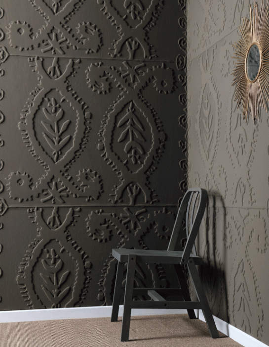 ‘Alliances’ by Elitis
Elitis has a selection of wall coverings produced by layering a jersey material over a foam-core sheet – which is then thermo-embossed. The resulting bas-relief patterns (2 years in R+D to perfect) are gorgeous.
……….
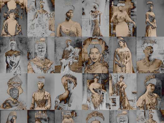 ‘August’ by Trove
Trove wallpaper is Randall Buck and Jee Levin‘s company – a collection of digitally produced papers. Most of the patterns in their collection have large-scale repeats. August, a grid pattern representing negative images of Queens (I’m wondering if there’s a double entendre here?) underscores the current trend toward silver and beige.
……….
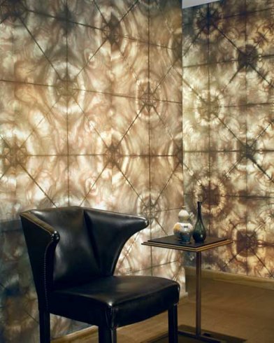 ‘Anniversary Snowflake’ by Maya Romanoff
For the company’s 40th anniversary, Maya Romanoff put out 4 ‘tie-dye-esque’ papers that are probably my favorite papers on the market. The company chose Amy Lau to re-interpret their signature tie-dying style. I admit I’ve had a design crush on Lau for years, but when these papers were introduced I was ready for marriage.
………..
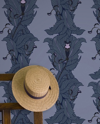 Ms. Treat by Grow House Grow
Ms. Treat from Grow House Grow is named after a famed 19th Century naturalist who had a penchant for carnivorous plant (which would explain the motif). I’m crazy for the macabre sensibility… so Little Shop of Horrors. The first time I saw this paper, I heard Ellen Green singing Somewhere That’s Green. (It’s 6:47 worth of your time, if you’ve not heard it, treat yourself).
……….
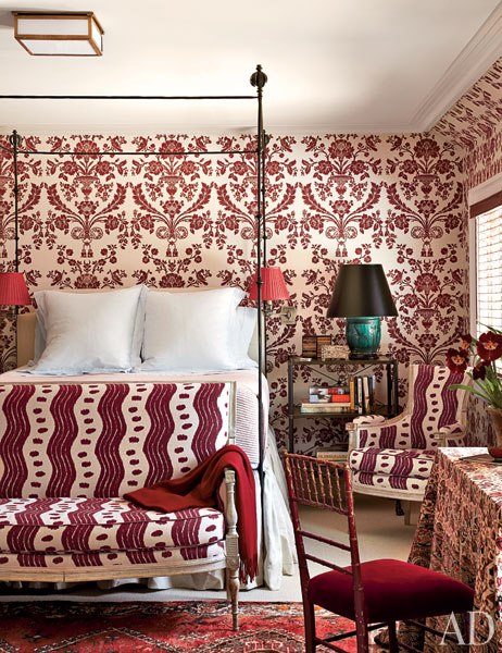
‘St. Antoine’ by Farrow and Ball Miles Redd Architectural Digest August 2012
This floral damask from Farrow and Ball, for me, is the best in the genre. Couple the pattern with F&B‘s famous hand-block printing and the distinctive “sea-weeding” it creates (you’ve got to see it in person to understand), and you’ve got old world technique made modern. Redd custom colored this paper, so the possibilities begin with your imagination.
……….
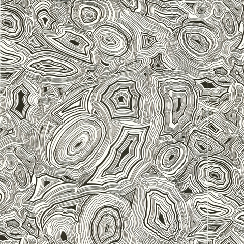 Malachite White by Cole and Sons
Trending toward papers that have been on the market for some time, I was reminded of Cole and Sons by my acquaintance Carl Lana. Sticking my head in at Lee Jofa, after I had my obligatory chit-chat with my favorite showroom manager Karen Rogers, I headed to the C&S swingers. I couldn’t find Malachite (??), but I found it online. You could do ANYTHING with this pattern.
……….
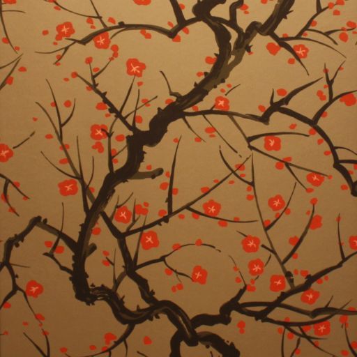 ‘Flower Quince’ by Clarence House
No conversation about venerable, large repeat wallpapers would (or could) be truly informed without mentioning Flower Quince from Clarence House. If you’ve been around the design industry as long as I have, you’ve seen this paper pop-up in a shelter magazine every 5 years. There’s a reason why, it’s MAJOR (click-through the link if you’ve missed the reference, or better yet, rent the movie).
……….
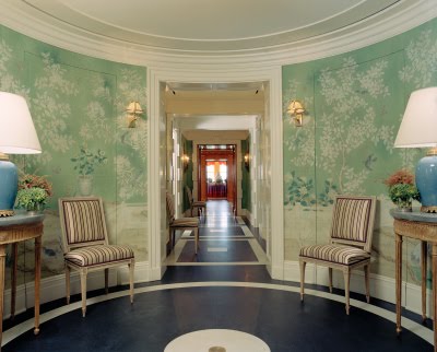
A custom design by Daniel Romualdez produced by Gracie
And last, but by no means least, is Gracie. I’ve yet had the privilege of spec’ing one of their remarkable papers on a project, but someday I will. Years ago as a curtain workroom owner, I’d work on a project now and again where one of their papers was installed (not name dropping here, but I made some of the curtains for TB’s Pierre apartment above, talk about palatial). Talking to Jennifer Gracie, I finally understand the cache – each of their designs is just a conversation-starter, they’re all painstakingly painted to match site elevations.
……….
Hope you’ve been inspired. If you’ve got a favorite grande repeat wallpaper I’ve missed, I’d love to hear about it! Leave a comment, or email me (it’s in the ‘about’ link above).

