 …………………………
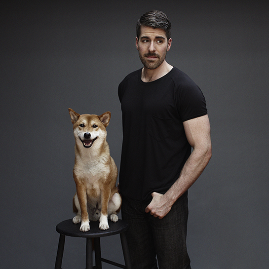
You know the phenomenon – someone’s name comes up in conversation so often that you finally decide you need to learn more about them. Zak Profera was that guy on my radar as 2012 came to a close. Friends were talking about how incredible stylish his printed linens were. I’d also been told that his beloved Shiba Inu ‘Shinji’ represents the ‘Fox’ in his company’s name.
So last week I asked him to meet me at Studio Four, where he is represented in New York, to show me his collection. We had a lengthy conversation about his career trajectory, and the fascinating intellectual design process behind each of his prints.
There are 10 designs in his collection, which come in a range of sophisticated colors that clearly position him as a determined style arbiter. It also bares mentioning that he’s willing to custom color any of them to meet your specifications. Interspersed in our Q & A you’ll find his patterns, along with commentary about his inspiration for each. I found it all fascinating: partially because they’re each so fresh, and perhaps more importantly because there’s an inherent and bona-fide thought process behind each of them.
…………………………
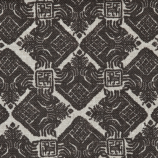
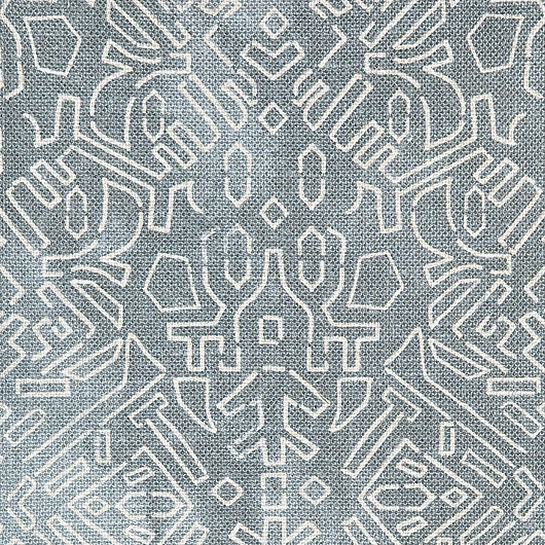 ‘Katagami’
‘An obscure antique stencil once used to decorate kimonos in the early 1900s served as the inspiration for Katagami – an earthy, tribally spirited design with an inky touch. I love that it’s origin, completely surprising and unpredictable.’
…………………………
Tell me about where you grew up, and about your schooling?
I grew up in LA and headed north after high school to attend the San Francisco Art Institute. I had entered for photography initially, and about a week in I discovered their “New Genres” program, which focused mainly on conceptual art. So naturally, I switched. When I had to make the decision to leave LA, Yoko Ono was launching her retrospective at SFMOMA titled “YES”, so I took that as a sign!
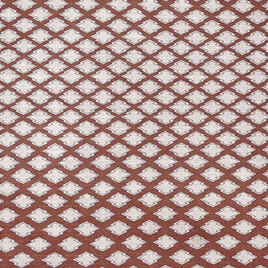
‘Palma’
“I adopted Palma’s silhouette from an antique Moorish coffer I spotted at auction; I thought it made a brilliant motif-driven pattern without being overwhelming — I gave it a lot of breathing room as well to prevent it from feeling too frilly.”
…………………………
How did you get introduced to interior design?
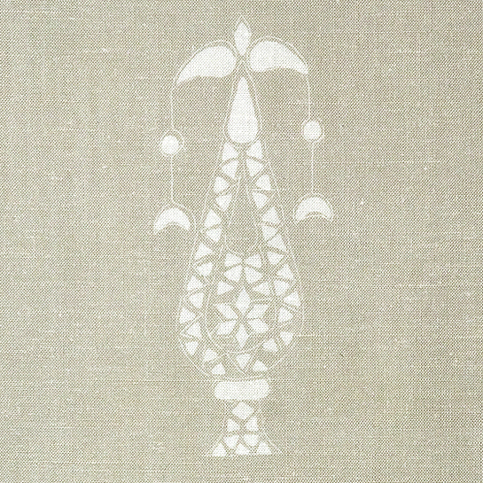
‘Postage’
“Postage was the first fabric pattern I designed and is without a doubt one of the most popular of the bunch. It’s source comes from a set of postage stamps — totally simple and handsome, but I kept its sketch marks and slightly off-set repeat in tact to give it some personality; I like that it reads as totally contemporary or extremely traditional depending on its usage.”
…………………………
How did you find your way to the decorative arts?
Fast-forward a few years, I moved to New York. My friend Sara Sugarman at Decorative Carpets called and asked if I’d like to collaborate on some rugs for a new line she wanted to launch. I didn’t think anything of it initially, except that it would be a joy to work with a friend. The response to the product was so wonderful that there wasn’t much question in my mind that this was something I should push forward with. The rugs were meant to be brave, with crazy pink hues and shocks of electric blue – which while I wholly appreciate – isn’t my personal style. I wanted to create something in line with my own aesthetic, so ZAK+FOX was born.
…………………………
 ‘Volubilis’
“Volubilis takes its name from the long-abandoned Roman ruins in Morocco, near Meknes. Though an earthquake destroyed most of the site in the late 4th century, the intricate mosaics and architecture have remained surprisingly well intact, even withstanding the test of time to this very day.
The mix of Volubilis’ motifs is a bit romanticized, combining the fine details of embroidery found throughout the Mediterranean with the imaginative tile-work seen on Volubilis’ grounds.”
…………………………
What’s your design process like?
I often start with some sense of history; like most in design, I have a personal collection of antiques and imagery that I often look to for inspiration. I love a sense of tradition, and I love the origin of “things”. So much of my thought process considers how to take something that is seen as traditional, or seen as historic, and present it in a new light. I make no attempt to hide where something came from; I think that’s one of the most beautiful aspects of being able to create something.
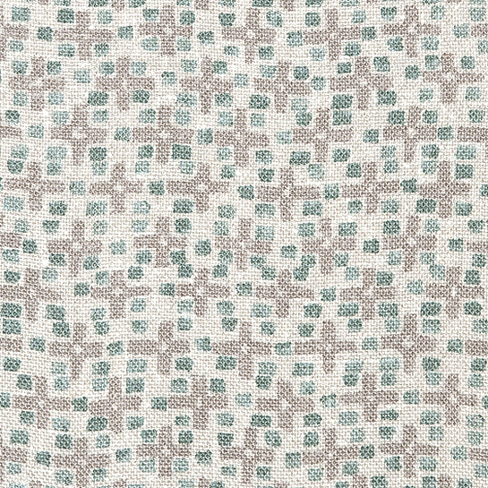
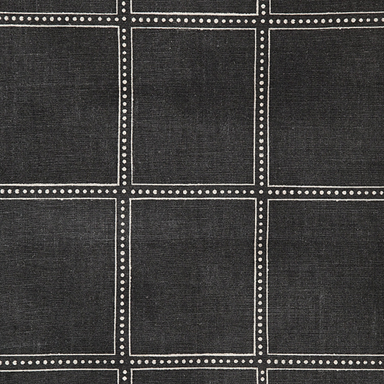
‘Plus’
“Plus takes its graphic cues from traditional Moroccan carpets, offering a small-scale repeat that’s versatile enough to be used in almost any application.”
…………………………
I understand that you’ve adopted a strict policy regarding manufacturing process, can you tell me about that?
 ‘Matsu’
“A traditional Japanese motif is printed in a kinetic arrangement that feels wonderfully modern despite its ancient heritage.”
…………………………
Who are some of the designers who champion your fabrics?
 ‘Jingasa’
“The Jingasa was used as a protective piece of headgear for samurais during the Edo period (1603-1867), typically made of black wood or metal with the exception of a minimalistic adornment painted in gold. Some simply shielded the warrior from the elements while others were used to ward against the dangers of battle.
This textile’s allover pattern is a modern take on a crest found upon an antique Jingasa; I imagined the spiraling trails almost like a map — a travel-with-the-wind sort of foot pattern.”
Where do you see your company in 10 years?
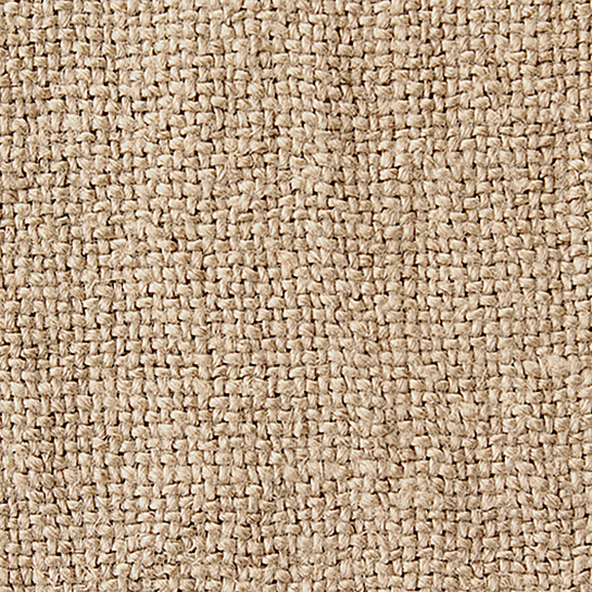
‘Kaya’ (stonewashed linen)
“The word “kaya” translates differently in a myriad of languages, but it was an undeniably perfect name for our rustic linen when we discovered that it happens to mean “stone” in Turkish. After an inspiring trip to Istanbul, we set out to assemble a small collection of fabric that embodied the spirit of the vintage Anatolian textiles we had discovered and had become so enamored with: luxe, unadorned, and authentic.
The creation of our stonewashed Kaya linen is an artisanal process, crafted in small batches and tumbled with volcanic rocks, giving it its slight, open weave and its effortless drape. The selvedges are reinforced during the weaving process, ensuring that no matter how rough and rugged the washing may be, it will maintain its structure and integrity.”
………………………….
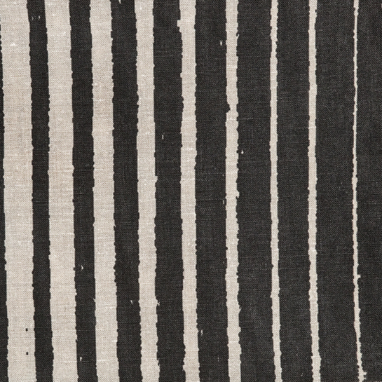
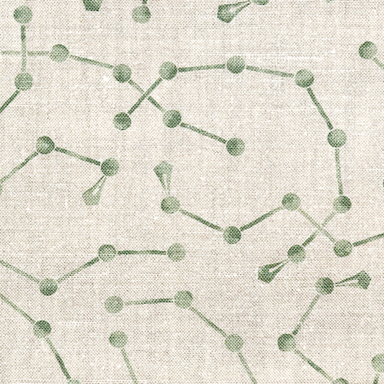
‘Takigawa’
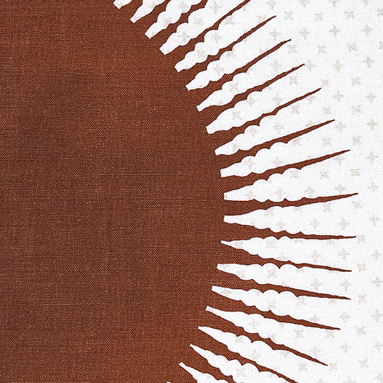
‘Karun’
“Antique textile-collector Karun Thakar told me that the original Matahari trade cloth that inspired this design was unlike any other Indian textile he had ever seen. ”The minimalist design of the sun with its kinetic rays,” he says, “has a universal appeal that makes its origin very difficult to place.” That’s exactly why I loved it, too.
Though these types of textiles were produced on the Coromandel Coast in India, they were used in Indonesia for their protective qualities, as the dark and light patterning holds significant meaning.”
…………………………
While few of us can predict the future (especially given that we’re only at the dawn of the information age), what I would feel safe in forecasting is that Zak+Fox will be around for quite some time to come. Do check out his website as several of his patterns are best seen from a pulled-back perspective, and follow this link to where his collection is represented. I’ll be scouring the shelter magazines to see the ways our community utilizes this fresh and thoroughly cohesive collection. More to be revealed!
.
 http://www.zakandfox.com/home/